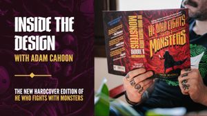
Some books invite you in before you even turn the first page.
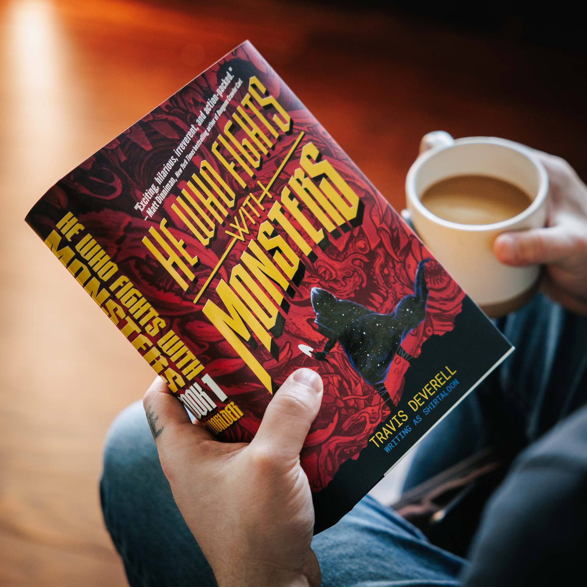
The new hardcover edition of He Who Fights With Monsters does exactly that—built not simply as a deluxe edition, but as a physical object designed to reflect the scale, danger, humor, and discovery that define one of fantasy’s most beloved LitRPG series.
For readers discovering the series for the first time—and longtime fans returning to Jason’s first adventure—this new edition of He Who Fights With Monsters, Book 1: Outworlder brings the million-copy bestselling fantasy phenomenon into a premium hardcover format, complete with a bonus short story exclusive to this release.
At the center of that design is artist and designer Adam Cahoon, whose work approached the book not just as cover art, but as an extension of the reading experience itself. Cahoon is an Artist and Designer for Vault Comics and a comic book artist known for his work with Vault Comics on The Nasty.
Below, Adam walks through the thinking behind the cover, typography, visual density, and the small decisions that shaped the final object.
When you first approached this hardcover, what did you want the physical object to communicate before someone even opened it?
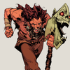
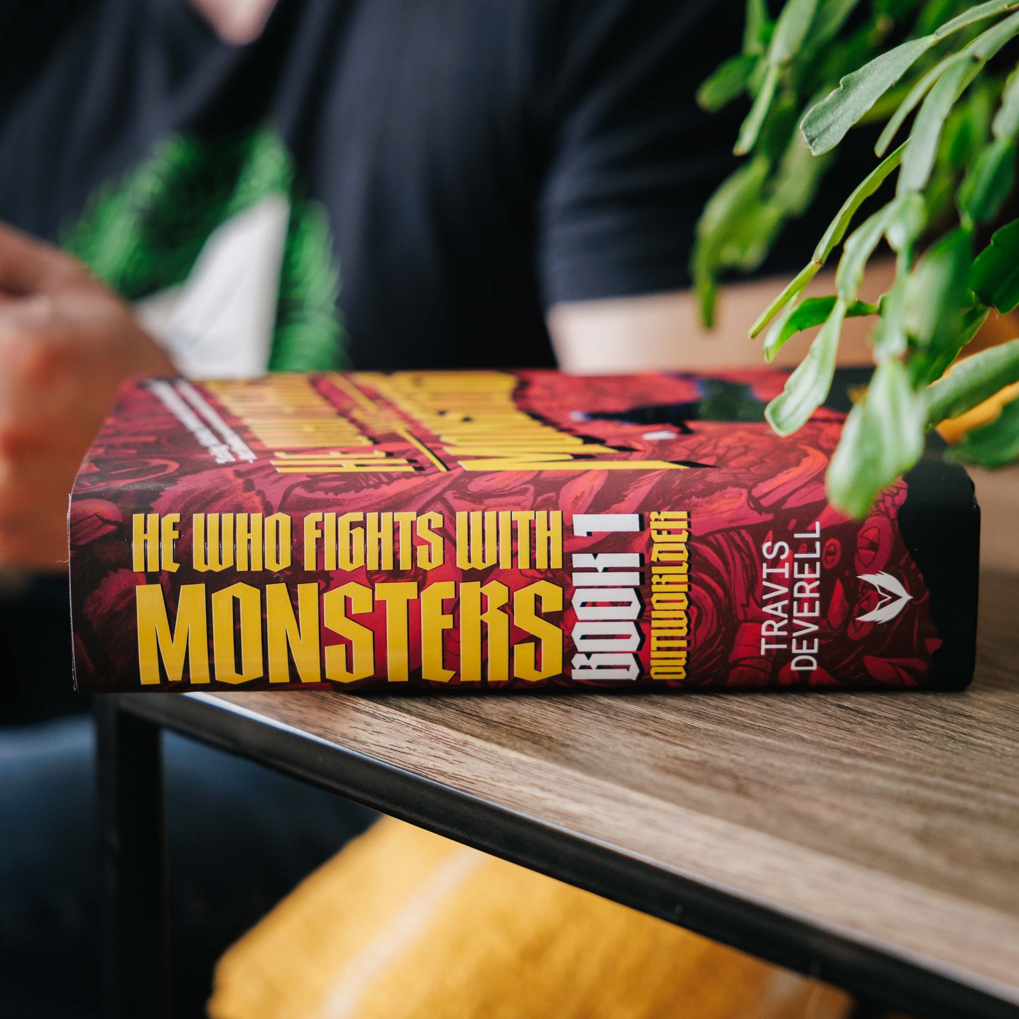
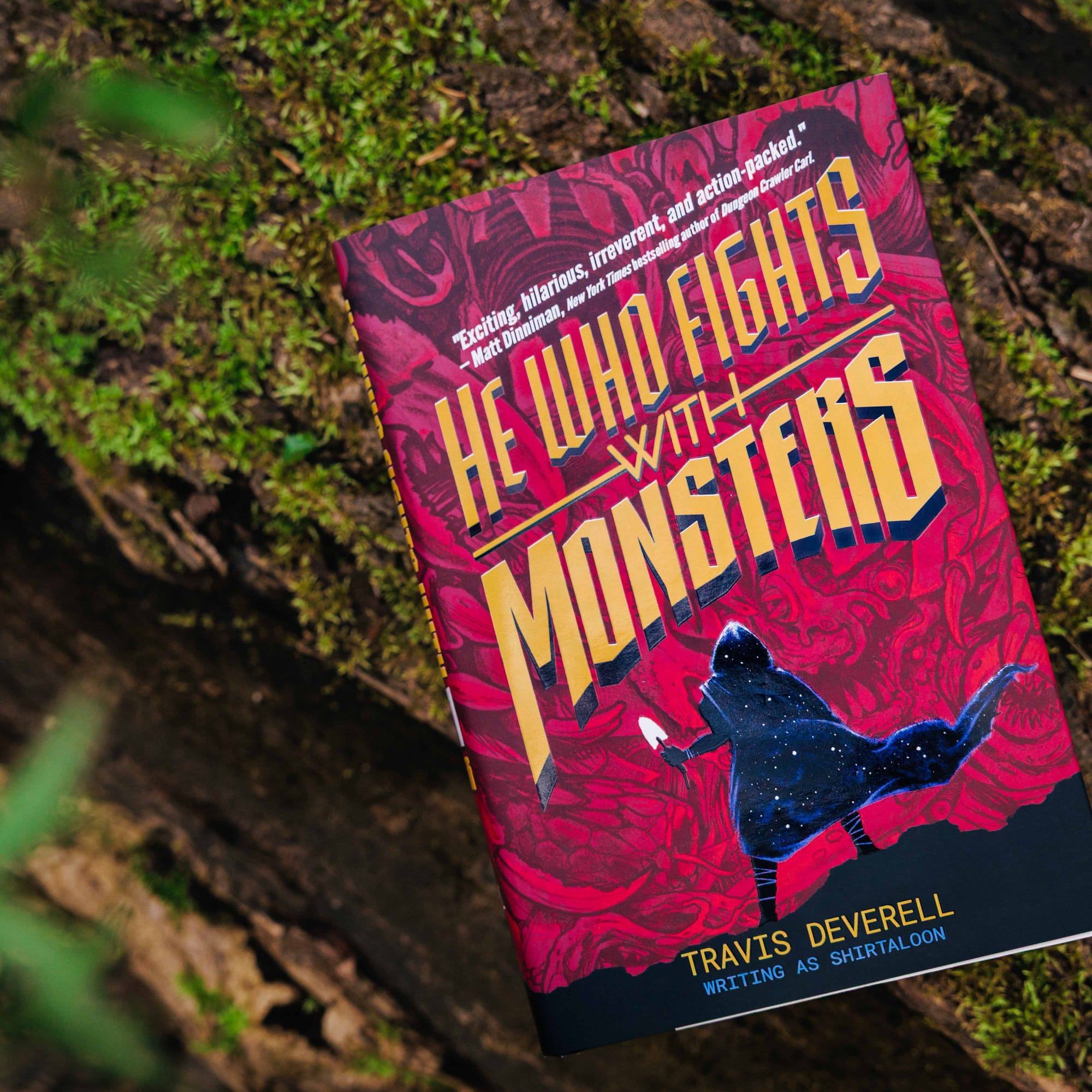
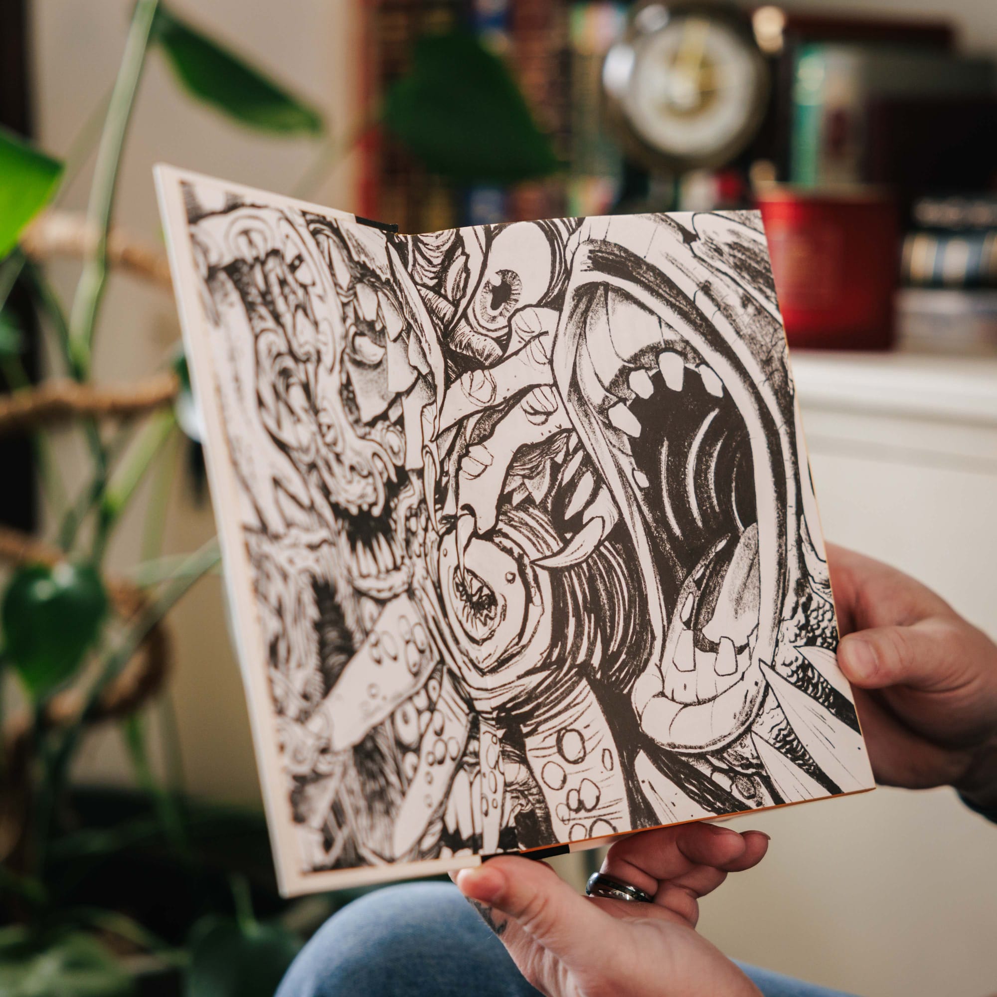
AC: I really wanted someone walking by this book to be struck by two things: scale and discovery. By placing a very small Jason (with a very small weapon) in front of an overwhelming wall of monsters, I really hoped to convey what I felt when I read He Who Fights With Monsters. To me, the story is so much about this massive world of danger that Jason finds himself in, and all he really starts out with is sarcasm and a trowel. But I also tried to over-design this book, covering it with an overabundance of visual elements, in the hope of evoking curiosity and discovery in each person holding it.
Which physical design detail are you most proud of in this edition, and why?
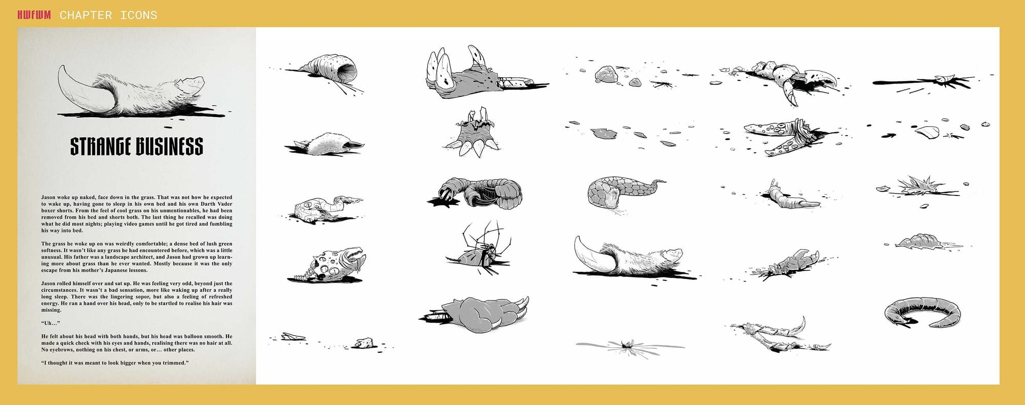
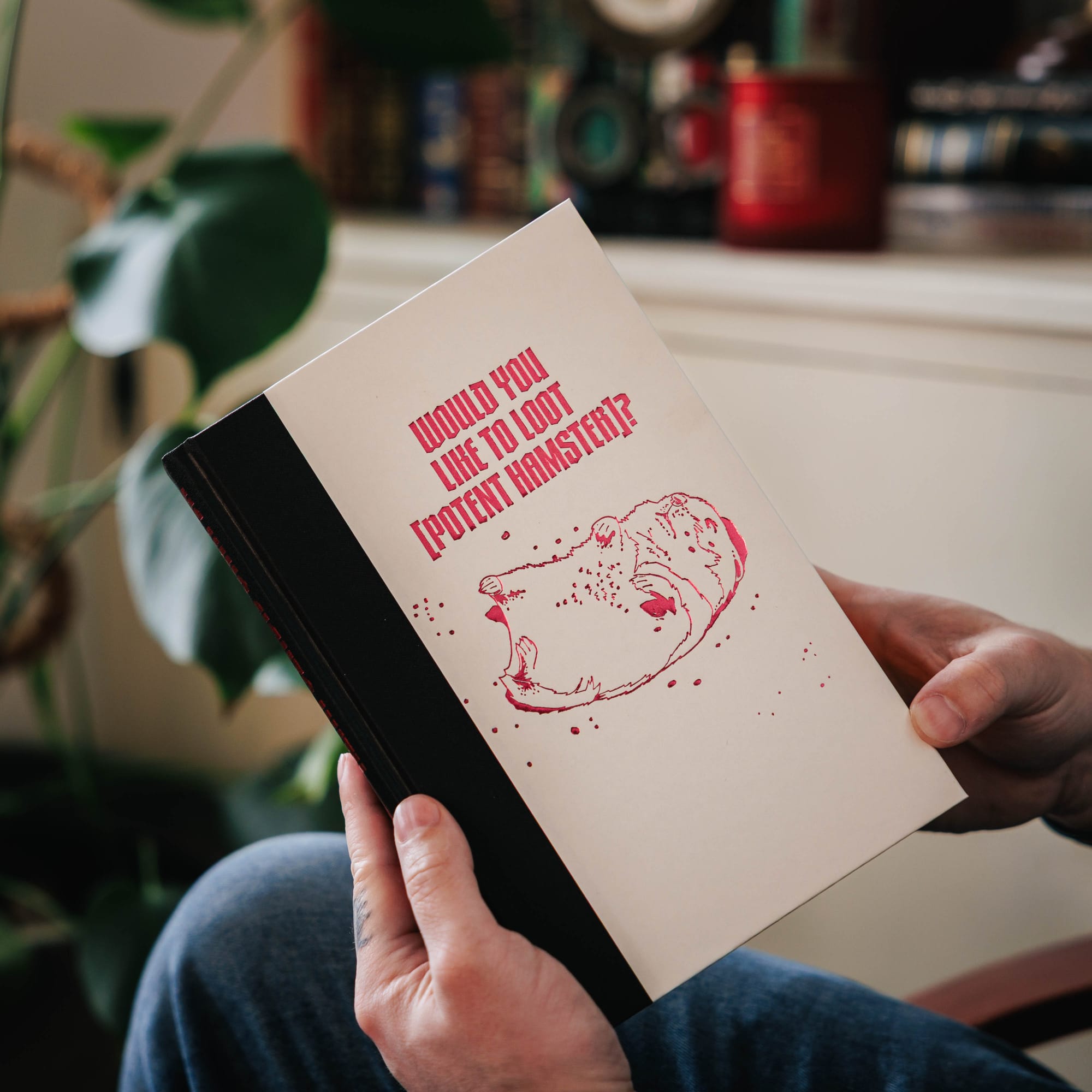
AC: It’s dumb, but I had the whole book designed, and then I put the pull quotes on the back (which had been straight across) at an angle to match the angle of the title logo on the front, and for some reason that made the whole book feel complete. And after that, I thought about it for like a week, just walking around thinking “those pull quotes really tied it all together”. I spent days drawing monsters and creatures, chapter header bits & pieces, and one potent hamster, and felt pretty good about the whole thing, then I put the pull quotes at an angle, and I felt like I’d revolutionized book design.
Was there a hidden or subtle design element readers might not notice right away?
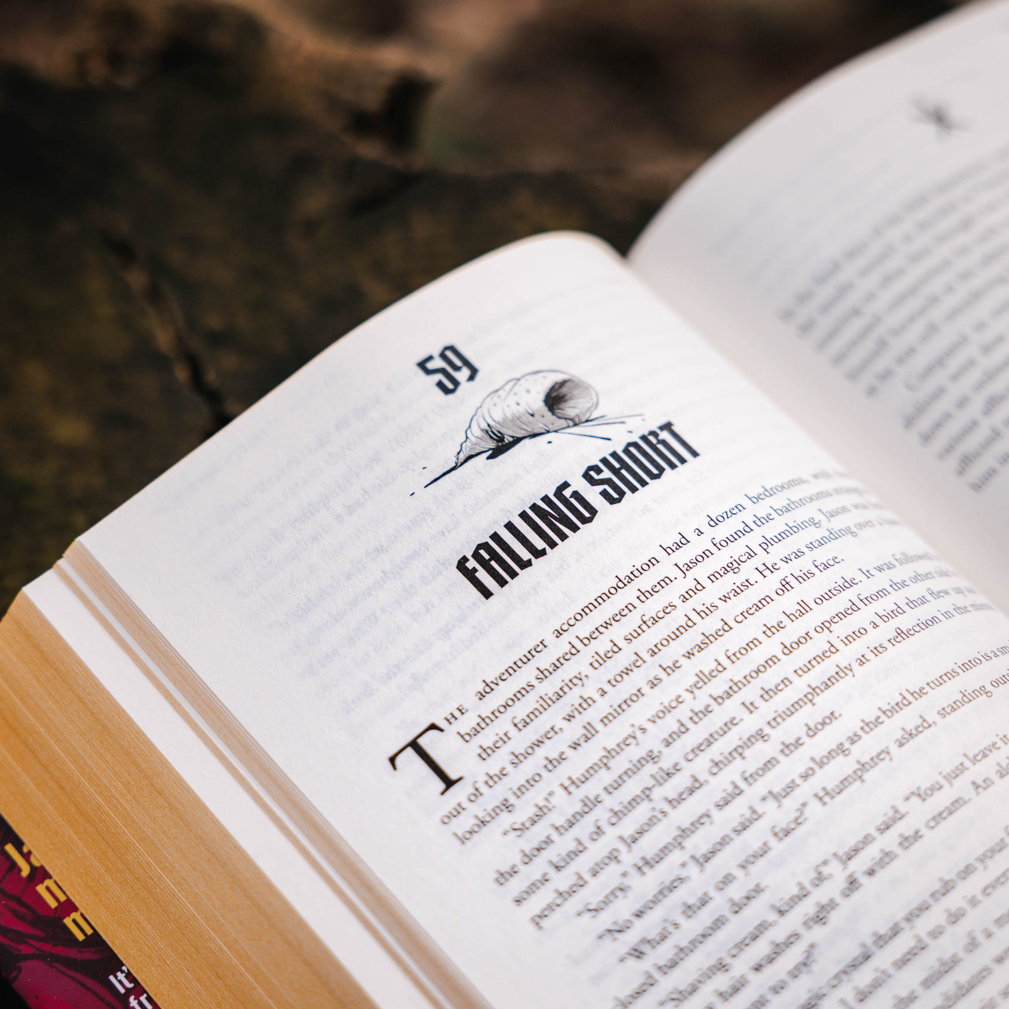
AC: There isn’t anything specific that I hid in the design, but overall, I really wanted there to be too much stuff to see in one go. I hope, with this design, that readers find new elements every time they pick it up: a new set of fangs, a creepy eye they never noticed that’s been staring at them the whole time. It’s sort of like a prey animal group defense tactic of overwhelming numbers, so that everything is hidden.
What visual references or mood influenced the final direction?
AC: At the time I was reading this book and beginning to design the cover, I was rewatching Genndy Tartakovsky’s Primal, and then after that, I rewatched Samurai Jack, so I was really thinking about a small hero facing a vast landscape of danger, very bold colors, and very efficient shapes. Also, the design for Dungeon Crawler Carl (the Ace edition) looms very large over me and was very much an inspiration. I put the quote on the case wrap as an homage to that series of books.
How did typography help define the identity of this edition?
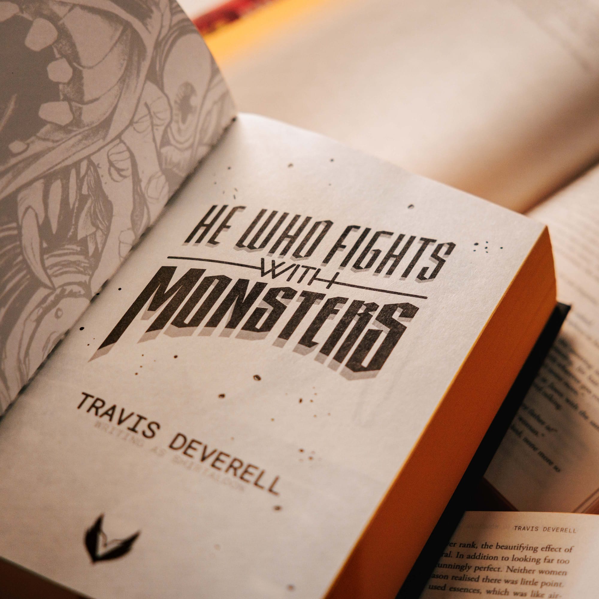
AC: I wanted the typography to feel like a 1950’s title card, something sweeping and dramatic, something that felt swashbuckling before you could even register what the words of the title said.
How do you design a book so it feels like part of the reading experience, not just packaging?
AC: With this book specifically, I tried to have visual elements at every angle so people would feel compelled to turn the book over, to examine it, to want to take the dust jacket off, and to make the book itself worthy of curiosity and discovery. I wanted to put them on their own little adventure as an opening act to the story itself.
About He Who Fights With Monsters: Book 1
He Who Fights With Monsters begins with Jason, an ordinary office-supplies-store middle manager who wakes up in a dangerous alternate world filled with monsters, cultists, aristocrats, gods, and magic.
Survival quickly becomes less about strength and more about wit, nerve, and adapting faster than the world can destroy him.
For longtime fantasy readers, LitRPG fans, and readers discovering the series for the first time, this deluxe hardcover edition offers a new way into one of modern fantasy’s breakout bestselling series—now with an exclusive bonus short story included only in this hardcover release.